HTML and CSS Updates
Table of Contents
Evolving Specifications
Early versions of HTML had major releases beginning in 1991. HTML 2 was published in 1995, HTML 3 in 1997, and HTML 4 from 1997 - 2000. After forays into XHTML in the early 2000s, HTML 5 was finally released in 2014. It had a few early version updates (HTML 5.1, 5.2, and 5.3), but ALL were officially retired in January 2021 in favor of the “HTML Living Standard.” CSS is much the same, just with different years.
What this means for you as a developer is that things keep getting added and trickle into the HTML5 and CSS3 specs feature by feature. What determines if any given feature can and should be used in your code isn’t whether or not it exists, but rather whether or not all the major browsers support it. If you ever want to try out something new, first check out the rule, element, selector, or pseudo-class at a site like MDN or Can I Use to make sure that the feature is considered “Baseline” and is widely supported.
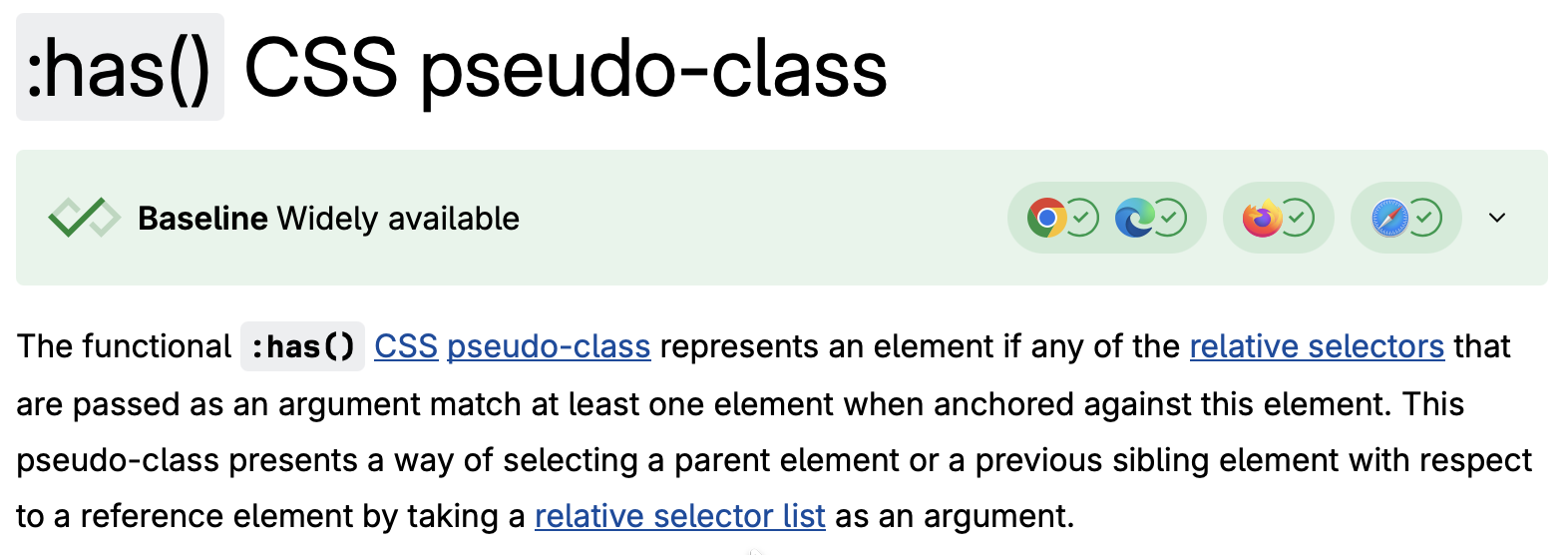
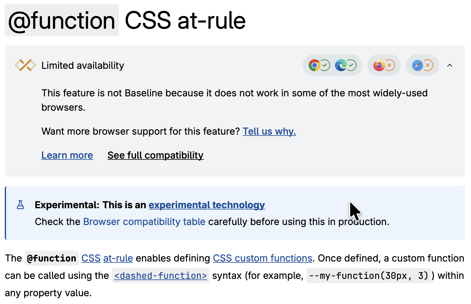
This also means that you probably don’t know about many of the greatest current features of HTML of CSS unless you find out through some blog or article or if you stumble across it somewhere on the web. But as you’ll see some of the very best features are invisible, or take things that used to be complicated and greatly simplify their implementation. For instance, CSS used to require pre-compilers like LESS, SASS, or SCSS to use nesting or variables, but that’s all in baseline CSS now.
Experimental Features
And there’s more to still coming… The following are being implemented, but not fully supported as baseline just yet.
Custom CSS @functions: Will allow for reusable logic that will return different values based on input parameters.
if() function: Will allow greater flexibility and easier theming.
attr() function: Will allow CSS changes based on HTML attributes. (Currently can only be applied to content. Coming soon to all properties.)
Scroll State Queries: Will allow you to change styles based on how a user has scrolled. Imagine a “hidey nav” instead of “sticky nav”.
Scroll-driven animations (see animation timeline and animation-range): Will allow you to easily trigger animations depending on how far the user has scrolled across a container.
…and a lot more. If you are building anything front-end facing and using a lot of JavaScript, odds are there are already features in place or working their way through the process of becoming a real spec.
Building Progressively
If you want to build something using new CSS features that are not widely supported, that’s okay! Just be sure to build things in a way that works cleanly with existing baseline CSS. You can use the CSS @supports rule to turn on new features as they become available. As an example, here is an accordion menu that ALWAYS works, meaning you can always open and close things. But in order to scroll smoothly from closed to open and back, you need to transition from a height of 0 to a height of auto and back. This requires the interpolate-size: allow-keywords attribute, which is not fully supported as of the time of writing.
How do you build progressively using CSS?
Building progressively in CSS means that your website works and has all required interactivity and accessibility features on every browser. But certain newer features are added in a way that doesn't break the existing code and doesn't require updates later.
Building progressively in CSS means that your website works and has all required interactivity and accessibility features on every browser. But certain newer features are added in a way that doesn't break the existing code and doesn't require updates later.
Building progressively in CSS means that your website works and has all required interactivity and accessibility features on every browser. But certain newer features are added in a way that doesn't break the existing code and doesn't require updates later.
What is the `@supports` rule?
The `@supports` rule allows you to make certain declarations only when the current browser allows it. This is similar to a `@media` query which turns on sometimes but not others.
Here’s how to apply something like this:
    #details-expand {

        /* This block ONLY is applied when a browser knows how to blend the transition. */
        @supports (interpolate-size: allow-keywords) {
            interpolate-size: allow-keywords;

            details {
                &::details-content {
                    block-size: 0;
                    transition:
                        block-size 1s allow-discrete,
                        content-visibility 1s allow-discrete;
                }

                &[open]::details-content {
                    block-size: auto;
                }
            }
        }

        /* This block ALWAYS applies... */
        details {
            background: hsl(0 0% 10%);
            border: 1px solid hsl(0 0% 25%);
            padding: .5em 1em;
            ...
        }
    }
HTML Updates
Form Validation
For a long time now, you’ve been able to have text <input> fields with a very specific type attribute, like type="email" or type="URL". But it always required JavaScript to handle validating the form, adding helper text, and all form processing. While it is STILL true that server-side validation is required (it’s very easy to manipulate an HTML page’s DOM before submission), most front-end validation is something that can be done without any JavaScript.
For this form, the HTML does the validation with a number of different attributes:
requiredmeans that the input is invalid if emptyminlengthandmaxlengthdetermine valid string lengthsmin,max, andstepare used for numberstypeensures the data fits a valid HTML input typepatternspecifies a valid regular expression
Here’s the HTML code:
<form>
    <label>First Name:
        <input type="text" name="first-name" required minlength="2">
    </label>
    <div class="feedback">Name must be at least 2 characters; no initials allowed.</div>

    <label>Email:
        <input type="email" name="email" required pattern="/^[\w-\.]+@([\w-]+\.)+[\w-]{2,4}$/">
    </label>
    <div class="feedback">Emails must be of the form xxx@xxx.xxx</div>

    <label>Whole Number between 1 and 10:
        <input type="number" min="1" max="10">
    </label>
    <div class="feedback">Read the label better, please.</div>
</form>
Note that the *Required text isn’t in the HTML. It’s in the CSS, and automatically appears after labels that have the required attribute:
input:invalid {
    border: 2px dashed red;
}

label:has(input:required:invalid)::after {
    content: " *Required";
    color: red;
}

/* Feedback is hidden by default */
.feedback {
    color: red;
    display: none;
}

/* :user-invalid means that the user has interacted with the element AND it's invalid */
label:has(input:user-invalid) + :is(.feedback) {
    display: block;
}
Full client-side form validation specification at MDN.
Opening and Closing Dialogs and Popups
Common behaviors that require no data and don’t leave a page include using a <button> to open and close dialogs, modals, and menus. This has usually been done with an onclick attribute and links to JavaScript. Now, no script is needed with HTML Invoker Commands.
Give a button a commandfor attribute with the target element’s ID. Then a command from the list of valid commands:
| Effect | Command |
|---|---|
| Show a popover | show-popover |
| Hide a popover | hide-popover |
| Toggle a popover | toggle-popover |
| Show a modal | show-modal |
| Hide a modal | close (WHY??? WHY???) |
Imagine a user options popover menu that is hidden by default but appears when you click on the user’s name in the upper right corner of the screen. No JS needed!
<button commandfor="user-menu" command="toggle-popover">Lucy F Knight</button>

<div id="user-menu" popover> <!-- The popover attribute lets the browser know to initially hide this -->
    <nav id="user-nav" aria-label="User options menu">
        <ul>
            <li><a href="#">Settings</a></li>
            <li><a href="#">...More Options...</a></li>
            <li><a href="#">Log Out</a></li>
        </ul>
    </nav>
</div>
Oh no! Our popover isn’t next to the button! Should we do some JavaScript and a bunch of custom logic like element.getBoundingClientRect() to get coordinates and then hard-code them in? And then add listeners for window.resize to recalculate???
NO! Just use a single line of CSS and the new position-area attribute. It’s a bit weird to get used to but lets you position things relative to an anchor in almost any conceivable way with just one line and two keywords. Full description here.
#user-menu {
    position-area: bottom span-right;
}
All commands also trigger JS events in case you need additional logic or handling. One other command, request-close closes a modal but watches for an event.preventDefault() trigger. More info in the spec. Custom commands that DO use custom JavaScript are also permitted.
What About Tooltips or Hints?
There’s a simple way to have things pop up when you hover or focus on something but before you click, and that is by using the new Interest Invoker (as opposed to the Command Invoker). Instead of using the commandfor with a target id, just use interestfor in the triggering element. This does NOT need to be a button, but must be a natively focus-able element, so <div>s and <span>s don’t work. I’ve used a link here.
<strong>Viola</strong>: How will this <a href="#" interestfor="define-fadge">fadge</a>?
<div id="define-fadge" popover="hint" style="position-area: top">Shakespeare made up lots of words. This one never took off.</div>
Focus using tab or mouse over the link below:
Viola: How will this fadge?
There are easy CSS attributes for detecting “interest” (meaning that something has been hovered/focused on long enough for the tooltip): [interestfor] and :interest-source. For example, let’s say that I want the regular tooltip delay to be 0.3 seconds, but if you’re already on a toolbar, moving from item to item should instantly show the next tooltip. Here’s the CSS for that:
[interestfor] {
    interest-delay-start: 0.3s;
}

.toolbar:has(:interest-source) [interestfor] {
    interest-delay-start: 0s;
}

/* Since [popover]s are really just any old div, they can be styled in ANY way */
.toolbar [popover] {
    font-size: .8em;
    position-area: top center;
    position-try-fallbacks: flip-block;  /* If you can't display on top (scrolled too high), flip to the bottom */
    ...
}
CSS Updates
Nesting
CSS used to only accept a single target per definition, like this:
main {
    background-color: #f2f2f2;
    /* ... more styles for the main section ... */
}

main .card {
    border: 1px solid gray;
    /* ... more styles for cards IN the main section ... */
}

main .card p {
    margin-top: 0;
    /* ... more styles for paragraphs IN cards IN the main section ... */
}
Now CSS allows for nested selectors. The same code can now be written like this:
main {
    background-color: #f2f2f2;
    /* ... more styles for the main section ... */

    .card {
        border: 1px solid gray;
        /* ... more styles for cards IN the main section ... */

        p {
            margin-top: 0;
            /* ... more styles for paragraphs IN cards IN the main section ... */
        }
    }
}
By using proper indentation and spacing, it’s possible to write code that is much more understandable with clear relationships between elements.
New Pseudo-classes
In CSS, a pseudo-class is a selector that lets you select elements based on information OTHER than what’s in the raw HTML. When these are being used, there is almost never a need to add custom class or id attributes to style elements in different states. For instance, you can give certain styles to a <button> element, but additional styles based on the button’s state. For example:
button {
    background-color: darkgreen;
    color: white;

    &:hover {   /* This is the same as `button:hover` */
        background-color: green;
    }

    &:focus {   /* Selected by keyboard or mouse click */
        outline: 2px solid blue;
    }

    &:active {   /* When the button is being clicked on */
        box-shadow: 0 2px 4px gray;
    }

    &:disabled {   /* When the button has the `disabled` attribute */
        background-color: gray;
        color: darkgray;
    }
}
There are several new pseudo-classes that allow for some significant simplifications in your code. For instance, <input> elements can have the following:
Input: State
| Pseudo-Class | What it Targets | Example Selector |
|---|---|---|
:checked | Any checkbox or radio button or <option> that is selected. | input[type="checkbox"]:checked |
:disabled | An input with the disabled HTML attribute. | input:disabled |
:enabled | Any input that DOESN’T have the disabled HTML attribute. | input:enabled |
:focus | Any input that is clicked or tabbed to. | input:focus |
:focus-within | A parent element where any CHILD element has focus. | form:focus-within |
:open | A <dialog>, <details>, <select>, or <input> with a picker (like date or color) that is opened. | input[type="color"]:open |
:placeholder-shown | Any text input that is showing the placeholder text. | input:placeholder-shown |
:read-only | Any input with the readonly HTML attribute. | input:read-only |
Input: Validation
| Pseudo-Class | What it Targets | Example Selector |
|---|---|---|
:in-range | Numeric input that is within the min and max values. | input[type="number"]:in-range |
:invalid | Any input that DOESN’T pass its HTML validation criteria. | input:invalid |
:optional | All inputs that DON’T have the required HTML attribute. | input:optional |
:out-of-range | Numeric input that are NOT within the min and max values. | input[type="number"]:out-of-range |
:required | Any input with the required HTML attribute. | input:required |
:valid | Any input that passes its HTML validation criteria. | input:valid |
:user-invalid | Any input that is invalid AND the user has interacted with it. | input:user-invalid |
It used to be that if you wanted a whole form to have a certain style if any of its children were invalid, you had to run a script and apply a class to the parent. Now you can use :has() where any valid selector can be in the parenthesis:
/* Finds any form with at least one child of type input:invalid */
form:has(input:invalid) {}

/* Targets any element with the `feedback` class that BELONGS to such a form */
form:has(input:invalid) .feedback {}
Variables and Cascading Variables
Variables are now native in CSS, and can be used for absolutely any kind of value: colors, lengths, percents, anything. They are declared using two dashes and read using the var() command. Variables are also scoped inside the DOM, and can be redeclared at greater specificity to override their values only at that level and below. For instance, an easy way to make a variable accessible to the whole page is to declare it in the :root pseudo-class:
:root {
    /* Colors can be ANY color format, hex, hsl, oklch, anything */
    --background-color: #f2f2f2;
    --text-color: black;

    /* Variables can be any type */
    --rounded-corner-size: 8px;
    --body-padding: 2em;
    --preferred-overflow: ellipsis;
}

/* Variables can be overwritten at any time, and any number of times */
body.dark-mode {
    --background-color: #161616;
    --text-color: white;
}

body {
    /* Implement the variables anywhere using var()
       The variables will be evaluated at their greatest specificity */
    background-color: var(--background-color);
    color: var(--text-color);
    text-overflow: var(--preferred-overflow);
}
Cascading Variables
Variables can be based off of other variables using the calc() function. Just be careful that all calc() and similar functions are only run when all the variables have the desired values. For instance:
:root {
    --brand-color: #FFC904;
}

.widget {
    &.red {
        --brand-color: red;
    }
    &.green {
        --brand-color: darkgreen;
    }
    &.blue {
        --brand-color: cornflowerblue;
    }

    /* If these lines were in :root, they would always render as yellow */
    --background-color: oklch(from var(--brand-color) 95% 15% h);
    --card-background-color: oklch(from var(--brand-color) 90% 20% h);
    --card-border-color: oklch(from var(--brand-color) 75% 50% h);
    --button-background-color: var(--brand-color);

    /* contrast-color() returns black or white based on the brightness of the input color */
    --background-text-color: contrast-color(var(--background-color));
    --card-text-color: contrast-color(var(--card-background-color));
    --button-text-color: contrast-color(var(--button-background-color));

    /* NOW, apply the variables */
    background-color: var(--background-color);
    color: var(--background-text-color);

    .card {
        border: 1px solid var(--card-border-color);
        background-color: var(--card-background-color);
        color: var(--card-text-color);

        button {
            background-color: var(--button-background-color);
            color: var(--button-text-color);
        }
    }
}
And just to show off, you can change variables with minimal JavaScript to show how dynamic the whole thing is:
const dynamicColorPicker = document.getElementById('dynamicColorPicker');

dyncmicColorPicker.addEventListener('input', (event) => {
    const newColor = event.target.value;
    document.getElementById('live-color-demo').style.setProperty('--brand-color', newColor);
})
Dark Mode
JavaScript is used to change the --brand-color variable based on user feedback, but everything else is done in CSS. First off, the Dark Mode checkbox’s value can be read in using CSS with the :checked pseudo-class, and applied back up to the parent using the :has() selector:
#live-color-demo {
    color-scheme: light;

    &:has(input[type="checkbox"]:checked) {
        color-scheme: dark;
    }
}
The color-scheme attribute is a native, built-in way to handle light and dark modes. This is not just using a variable, it is letting the rest of your CSS know that it is in light or dark mode, which allows you to use things like the light-dark() function. light-dark() takes in two colors (comma-separated), and uses the first color when in light mode and the second when in dark mode. So in the example above, I wanted the main background to be a very light version of the selected --brand-color and the dark version to be a very dim version. That can be done in one line.
--background-color: light-dark(oklch(from var(--brand-color) 95% 15% h), oklch(from var(--brand-color) 15% 15% h));
The final version of the CSS looks something like this…
/* Note: I've removed non-color styles like padding and margin for clarity. */
#live-color-demo {
    --brand-color: #FFC904;
    color-scheme: light;

    &:has(input[type="checkbox"]:checked) {
        color-scheme: dark;
    }

    /* Each section's color DEFAULTS to the brand color, but can be overwritten locally. */
    --current-color: var(--brand-color);
    --background-color: light-dark(oklch(from var(--current-color) 95% 15% h), oklch(from var(--current-color) 15% 15% h));
    --background-text-color: contrast-color(var(--background-color));

    background-color: var(--background-color);
    color: var(--background-text-color);

    .card {
        /* Note that it's okay to use --current-color here and override it lower down the page */
        --card-background-color: light-dark(oklch(from var(--current-color) 90% 20% h), oklch(from var(--current-color) 25% 20% h));
        --card-border-color: light-dark(oklch(from var(--current-color) 75% 50% h), oklch(from var(--current-color) 35% 50% h));
        --card-text-color: contrast-color(var(--card-background-color));
        --button-background-color: var(--current-color);
        --button-text-color: contrast-color(var(--button-background-color));

        &.secondary {
            /* Take the brand color and rotate 60 degrees around a 360 degree color wheel */
            --current-color: oklch(from var(--brand-color) l c calc(h + 60));
        }

        &.tertiary {
            /* Take the brand color and rotate -60 degrees around a 360 degree color wheel */
            --current-color: oklch(from var(--brand-color) l c calc(h - 60));
        }

        /* AFTER computing the values of the colors, apply them to each card */
        background-color: var(--card-background-color);
        border: 1px solid var(--card-border-color);
        color: var(--card-text-color);

        button {
            background-color: var(--button-background-color);
            color: var(--button-text-color);
        }
    }
}
This is a LOT of CSS, and it looks particularly daunting with all of the oklch() derived colors. But the goal is to offload all the presentation logic, conditions, and states away from the HTML and JavaScript so that those systems can be clutter-free and easy to maintain is spot on. Here’s the actual HTML for that portion:
<div id="live-color-demo">
    <div class="widget">
        <div class="widget-header">
            <h3>Dynamic Widget</h3>
            <div>
                <label><input type="checkbox">Dark Mode</label>
                <input type="color" id="dynamicColorPicker" value="#FFC904">
            </div>
        </div>
        <p>Changing the input color cascades to the whole thing!<p>
        <div class="card-container">
            <div class="card">
                <h4>Primary Color</h4>
                <p>Exactly what the user chooses.</p>
                <button>Call to Action</button>
            </div>
            <div class="card secondary">
                <h4>Secondary Color</h4>
                <p>Using oklch() you can change hue based on an input.</p>
                <button>Call to Action</button>
            </div>
            <div class="card tertiary">
                <h4>Tertiary Color</h4>
                <p>All colors will be ajdusted automatically.</p>
                <button>Call to Action</button>
            </div>
        </div>
    </div>
</div>
Animations from Nothing
When elements appear or disappear not just with a style, but from the page and DOM, they couldn’t animate or transition. They just “pop” into existence (this is incredibly common in React, say). The fix was to first pop in the element in its “off” state, then use JavaScript to pause for a bit, then apply new classes or styles on top to transition. Yuck.
But there’s a CSS-only fix for that: @starting-style. It adds a start state when elements appear out of nowhere that you can transition from so the animations work. The below example is for a modal, using the HTML command introduced above.
HTML for modal pop-up
<button commandfor="fade-in-modal" command="open-modal">Open Modal</button>
<dialog id="fade-in-modal">
    <h2>Smooth Transitions</h2>
    <p>This modal smoothly transitions.</p>
    <button commandfor="fade-in-modal" command="close">Close</button>
</dialog>
CSS Part 1: How to fade IN from nothing
Using the @starting-style, we can make sure that the modal fades in nicely, but it will still disappear immediately when closed.
#fade-in-modal {
    transition:
        opacity 0.5s,
        scale 0.5s;

    &[open] {
        opacity: 1;
        scale: 1;

        @starting-style {
            opacity: 0;
            scale: 0.75;
        }
    }
}
CSS Part 2: How to fade OUT instead of disappearing
There’s an easy non-JavaScript answer for this, too! It’s a transition property called allow-discrete. This property has no effect on regular animations, but allows things with discrete on/off states (like display and overlay) to animate instead of just toggle.
#fade-in-modal {
    /* Include the OFF attributes as default... This allows fading out */
    opacity: 0;
    scale: 0.75;

    transition:
        opacity 0.5s,
        scale 0.5s,
        display 0.5s allow-discrete,
        overlay 0.5s allow-discrete;    /* The overlay properly prevents click-throughs behind the modal */

    &[open] {
        opacity: 1;
        scale: 1;

        @starting-style {
            opacity: 0;
            scale: 0.75;
        }
    }

    /* Want the backdrop to fade in and out, too? No problem! */
    &::backdrop {
        /* Remember to give the element the "off" CSS by default. */
        opacity: 0;
        transition:
            opacity 0.5s,
            display 0.5s allow-discrete,
            overlay 0.5s allow-discrete;
        background: #22222280;
    }

    &[open]::backdrop {
        opacity: 1;

        @starting-style {
            opacity: 0;
        }
    }
}
Full documentation for allow-discrete on MDN.
Full documentation for @starting-style on MDN.
<textarea> elements can resize automatically
<textarea> elements can now grow and shrink dynamically without JavaScript! Before, the only way was for users to manually resize by dragging a little handlebar.
textarea {
    field-sizing: content; /* magic new attribute! */
    resize: none; /* disable user resizing, since that overrides the automatic one */
    min-height: 3lh; /* can still set minimum and maximum height using CURRENT FONT LINE HEIGHT */
    max-height: 8lh;
    min-width: 25em;
}
Like so: